

Wood frame wall art looks best when its wood tone matches or deliberately contrasts with the wood already in the room. Keep to two or three wood tones, match their undertones (warm yellow, red or cool brown), and choose art whose colors come from the same family, such as forest greens, amber and slate blue.
- Limit a room to two or three wood tones, and repeat each one at least twice so it looks planned.
- Match undertones: oak and pine run warm yellow, cherry runs red, and walnut runs a darker, cooler brown.
- Art should span about two thirds to three quarters of the width of the furniture below it, so 60 inches over a 90 inch sofa.
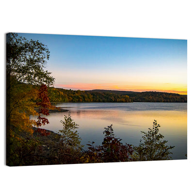
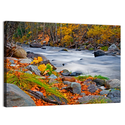
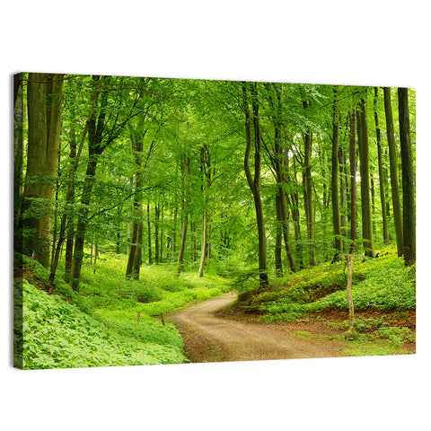
- Forest, cabin and autumn landscapes share the colors of natural wood, which makes them the easiest pairing.
- Pantone's 2026 Color of the Year, Cloud Dancer, is a warm white that sits well against wood walls and furniture.
How Do You Pair Wall Art With Wood in a Room?
Start with the largest wood surface, such as paneling, a floor or a dining table, and pick art that shares its undertone. A warm oak room suits amber, gold and forest green, while a dark walnut room suits cream, slate blue and deep red. The art then looks like part of the room rather than a patch on it.
Once the main tone is settled, count how many woods are in view. Three is the practical limit, and each should show up twice: a floor and a table, say, or paneling and a shelf. Mixed woods without repeats look accidental.

| Wood tone | Undertone | Art colors that pair | Best subjects |
|---|---|---|---|
| Light oak, ash, birch | Pale, slightly yellow | Soft blue, sage, white, sand | Fjords, birch groves, snowy hills |
| Natural pine, honey oak | Warm yellow-orange | Forest green, cream, rust | Cabins, meadows, autumn lanes |
| Cherry, mahogany | Red-brown | Deep green, gold, cream | Traditional landscapes, harbor scenes |
| Walnut, espresso | Dark, cool brown | Cream, slate, ochre, teal | Misty forests, abstract landscapes |
| Weathered gray, driftwood | Cool gray | Navy, white, muted green | Seascapes, piers, lakes |
Pro tip: Hold a paint chip or a fabric swatch from the art up to the wood. If it looks harsh against the grain in daylight, it will look harsh on the wall, and a different art color is a quick fix.
Does Wood Frame Wall Art Need to Match the Furniture?
No, it needs to relate to it. Matching exactly can look flat, so aim for the same undertone in a different shade: a honey-toned frame beside a pine table, or a dark brown frame beside a walnut sideboard. Contrast works too, if it is deliberate, such as a pale ash frame against a dark paneled wall.
Our guide to choosing a frame type walks through the options, and the framed wall art for living rooms collection shows finished pieces in a room setting. Search interest points the same way, with "wood frame wall art" drawing about 590 searches a month and "large picture frames 24x36" about 320 in the US.
Watch out: Three tones that look close but not identical, such as a yellow oak floor, a reddish cherry table and a gray-brown frame, produce a muddy effect. Either match undertones or make the difference obvious.
What Art Works on Wood Paneling and Plank Walls?
On dark paneling, choose a large piece with light areas in the picture, so it does not disappear. A 48x32 or 60x40 inch landscape with sky, water or snow gives the wall a bright focal point. On light plank or shiplap walls, richer pieces with deep green or amber hold their own.
Paneled rooms often have strong vertical lines, which suit portrait pieces too. A tall forest in a 20x40 or 24x48 inch portrait echoes the boards and draws the eye up.

Take a 90 inch leather sofa against an oak-paneled wall, with a sofa back height of 34 inches. Two thirds of the sofa is 60 inches, so a 60x40 inch landscape of an autumn forest fits. Hang its bottom edge 8 inches above the sofa back, at 42 inches. The top lands at 82 inches and the center at 62 inches.
Which Wooden Decor Ideas Work Room by Room?
Living Room
Let the largest wood piece set the tone and put one big landscape over the sofa. A cabin or forest scene in warm light echoes the wood without repeating it. Our forest wall art suits pine, oak and walnut alike.

Dining Room
A wooden table in a dining room is the focal point, so keep the art quiet. Hang a landscape 36x24 inches over a sideboard, or a pair of separate pieces on either side of a window. A lake or harbor scene with cool blues balances warm wood.
Bedroom
Wood headboards and nightstands call for soft, calm art. Hang a 48x16 inch panoramic 8 to 12 inches over the headboard, with a mist or sunrise scene in muted tones. Avoid dark, busy pieces on dark wood.

Kitchen and Entry
Butcher block counters and open wood shelves suit botanical or farmhouse subjects in square sizes, 12x12 or 16x16 inches. In an entry, a 24x16 or 30x20 inch piece above a wooden bench makes a welcome. See our country art for subjects of this kind.
Home Office
A wooden desk and shelving feel warm already, so choose a calm, wide piece: a lake or a tree-lined path. Hang it where you can see it from the chair, with its center at 57 to 60 inches from the floor.
How Do You Choose the Right Size for Wood-Toned Rooms?
Use the same sizing rules as any wall: two thirds to three quarters of the furniture width, and a center 57 to 60 inches from the floor. Wood is visually heavy, so go slightly larger on a wood wall. An 84 inch sofa on a paneled wall suits the top of the range, a 63 inch wide piece, rather than the bottom.
- Measure the width of the sofa, table or bed below the wall space.
- Multiply by 0.67 and 0.75 to get the width range for the art.
- Pick the closest size: 36x24, 48x32 or 60x40 for landscapes, 48x16 or 60x20 for panoramics.
- Cut a paper template, tape it to the wall and check it for a day.
- Hang with the bottom edge 6 to 10 inches above furniture.

What Wood Trends Matter in 2026?
Warm and natural wins in 2026. Pantone's Cloud Dancer, a warm white, replaces cool gray as the backdrop, and Benjamin Moore's Silhouette, a dark espresso-charcoal, appears as the deep alternative. Both sit well with natural oak and walnut, since neither fights the grain.
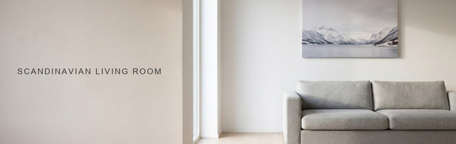
The same warmth runs through our guides to Scandinavian living rooms and farmhouse wall decor, where pale and mid-tone woods do most of the work.
Every piece is printed to order and ships free across the US. Start with the wood tone in your room, then match the art colors from the table above.
Forest wall art Tree prints Landscape canvas paintings Country art
Quick answers
Common Questions
What color art goes with wood furniture?
Art in forest green, amber, cream, slate blue and rust goes with most wood furniture. Match the undertone: warm yellow woods like oak and pine suit green and gold, while dark walnut suits cream, ochre and teal. A landscape that already contains wood or earth tones is the easiest choice.
Can you mix different wood tones in one room?
Yes, up to three. Repeat each tone at least twice, such as a floor and a table in oak and a shelf and a frame in walnut. Keep undertones in the same family, either warm or cool, so the woods look related. Wall art can bridge two tones by including both colors.
What size art goes over a wooden console or sideboard?
Choose art about two thirds to three quarters as wide as the console. Over a 48 inch console that means 32 to 36 inches, so a 36x24 landscape or a 36x12 panoramic fits. Hang the bottom edge 6 to 10 inches above the top, or center the piece at 57 to 60 inches.
What looks good on a wood paneled wall?
Large pieces with light areas in the picture, such as sky, snow or water, stand out best on dark paneling. A 48x32 or 60x40 inch landscape works over a sofa, and a tall portrait forest echoes vertical boards. Avoid small, dark pieces that vanish into the grain.
Should the frame match the wood in the room?
It should relate to it. Match the undertone of the nearest large wood piece in a different shade, or choose a contrast on purpose. Avoid close but not identical tones side by side. If the room has three woods already, choose the frame that matches the most visible one.